This website uses cookies so that we can provide you with the best user experience possible. Cookie information is stored in your browser and performs functions such as recognising you when you return to our website and helping our team to understand which sections of the website you find most interesting and useful.

Posted on November 3, 2021 in Marketing Thoughts
Three Ways to Increase Online Sales
Sales. Leads. Conversions. Actions. Whatever phrasing you use, the point is that you want a website visitor to do something on your website. The more people that commit this action th better your business (cause, non-profit, etc) will be. A quick and easy answer is to increase the sourcing of web traffic- do more work on your social media, try out Google Adwords, send out emails, etc. This requires more effort, time and often more money. However, if you are doing all of this without fixing the website itself, you are wasting an incredible amount of money. With no additional investment and effort, what would the result be if you converted 1% more of your website traffic, 2%, 5%? When looking at the below example, think of your own business- what would more people who commit an action mean to your business?
A law firm gets 10,000 monthly visitors through all marketing efforts. They currently convert 2.5 percent of those web visitors to leads. That equals 250 people. Out of those leads 7.5 percent convert into qualified clients, meaning 18 new cases for the firm.
For 1 percent more equals 350, For 2 percent m0re that is 450 , For 5 percent more 750 new web visitors into leads. That would mean that 26, 33 and 56 new clients, respectively.
You can easily see that increasing what is done on the website can have huge and immediate impact on your business. If you do these three things, you will increase your online sales.
- Understand Your Customer’s Buying Phases
- Enhance the Customer Experience (CX)
- Improve the User Experience (UX)
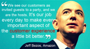
All three are intertwined. The modern customer is complex. There is no longer one size fits all motif that fits. Customers are at different stages of the buying cycle. (Read our blog, that goes more in depth about buying cycles ) The overall thing to understand is that people are at different stages when they visit your website. Some are still gathering information, and some are ready to convert immediately and move to the next step. If you treat every website visitor like they are ready to convert immediately, you will lose many that aren’t ready for that. Imagine a real world example of walking into a store and the salesperson asking you to checkout immediately. Even if you don’t leave, you probably will feel pressured and not enjoy yourself as much. However, taking that scenario further when the customer is ready to check out they don’t a salesperson just continuing to give you more information. Not only understanding that people are at different stages of the buying cycle, but actually doing something on your website that addresses that. This is where Customer Experience (CX) and User Experience (UX) come together. Customer experience is technically defined as “the product of interaction between an organization and a customer over the duration of their relationship”. More easily stated, CX is the way the person feels when doing business with you. How happy (or not) are they with the experience? Jeff Bezos said the below about customer experience.

We see our customers as invited guests to a party, and we are the hosts. It’s our job every day to make every important aspect of the customer experience a little bit better.” – Jeff Bezos
User Experience
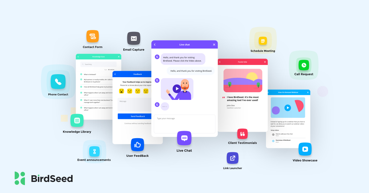
If CX is the “why” a website must address the issue of customers being at different stages, then UX is the solution as to how you can change it. User experience is defined as the experience and flow that the user takes on your website. Design, navigation, menu, forms and so much more go into UX planning. ( I really enjoyed this piece by designer Johannes Ippen that talks about the importance of remembering that UX is built for humans, not just a bar for metrics, KPIS and workflows ) To optimize UX a website has to be simple to use, easy to navigate and provide all of the various communication methods that a web visitor might want. For as customers are in different stages of the buying cycle, there is also a wide variety of variance in the method that a user is most comfortable engaging with your brand. Some people want live chat, others want to watch videos, some are more comfortable emailing, etc.
To do all of the above on your website seems like a difficult, if not impossible task to blend all three. And it was…Until BirdSeed.
When BirdSeed was created, these three challenges were at the center of our build. We wanted to offer something FREE that any sized business could utilize and incorporate easily into their website. Our tool improves the CX and UX of any website. Whatever buying phase they are in and whatever communication method, they prefer all is offered with one simple click of a box. The customer can engage how and when they are ready in an easy way. Discover what BirdSeed can do for your website, today.
Until Next Time,
Robert Urban – CMO of BirdSeed
 Current CMO of BirdSeed and best-selling author, Marine veteran and PhD. Offers expert-level strategy and execution for SAAS and technology business through relationship driven marketing, content and sales while leading and managing people from all different backgrounds. BirdSeed is headquartered in Orlando, Florida.


